Tuesday, April 21, 2015

The Limited

 I love The Limited. Their clothes are so chic and so are their displays.


The Limited really went all out for this display. The white background helps to focus the attention on the mannequins. Emphasis on the accessories is created through the spotlights and the columns.


The signage says "Effortless" and all of the mannequins and their outfits give off that vibe. 


The window is easy for walk by traffic to see. Proportion and scale was played with in order to grab attention. 

Express II

This is the second time I have evaluated Express's window.  I am always drawn to the simplicity and straightforwardness of their displays. 


The signage was very applicable with summer right around the corner. It would make a passerby think about the upcoming season and maybe prompt them to go inside the store to purchase an item. 


The emphasis is on the poster in the background. The lights focus on it bringing the customer's attention to it. The balance in the display is asymmetrical but it works! 
The window is filled with mannequins creating proportion. 

This display definitely got me in the mood for summer! 

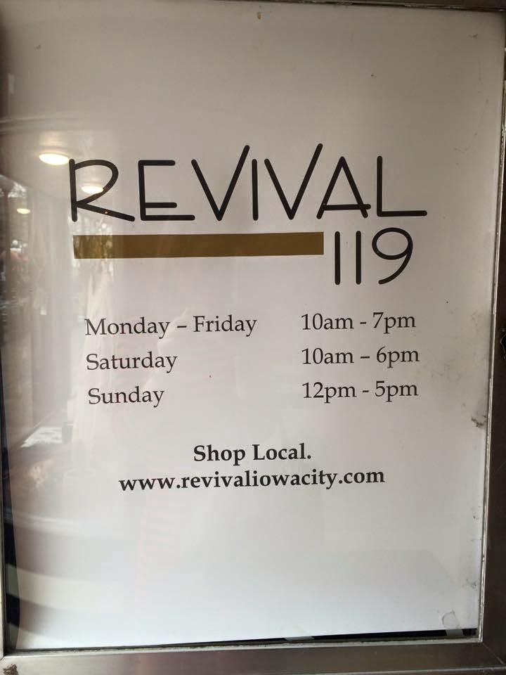
Revival 119


My third stop on the Iowa adventure was Revival 119. 


I love how this display created an entire little nook using merchandise that is for sale. The display gives off the vibe that you are inside of your closet. 


The emphasis was on the shoes. The decor on the wall helps to catch the customer's eye while slowly bringing the attention to the shoes on the lower level. This display had great unity, there was harmony and uniformity of the design principles. 

I am surprised I walked out of there without buying any shoes! 

Revival

Revival is one of my favorite stores in Iowa City. Its a boutique with a mix of new and vintage. 


I liked this little corner inside of the store. I think the shelf with the fabric background is really unique. They filled it with merchandise that fits the character of the store. 


The display is a random mix of things but that's what makes it work. It could have been cleaned up a little better but overall the display had nice proportion. When walking by it was easy to see what was displayed. The items were distributed in such a way that balance was created. 


The emphasis was the shelf. A customer's eyes were drawn there because of the sheet hanging in the background. 


Monday, April 20, 2015

The White Rabbit

The second store I stopped at was The White Rabbit.


I loved all of their products and I especially loved this display. They used their own merchandise to create a display. 


The display is asymmetrical. The emphasis is on the hanging plants, the eye is naturally drawn there because it's not sitting on the table and the triangle helps pull in the attention. 
There is a lot of merchandise on the table but proportion is maintained. 
The displayed maintained the store's cute and unique personality.  

AKAR


This weekend I was in Iowa City. It is such an adorable campus town with tons of cute shops! 


The first store I stopped at was AKAR.


I loved the way they displayed their jewelry.  Their jewelry was displayed with balance.  The equality of visual weight in the display is distributed evenly.


The jewelry is evenly placed so it's easy to see everything in the case. On top of the case there is jewelry featured and a mirror so someone can see what the jewelry might look like on. 

The display created great unity and the simplicity makes it easy for a consumer to see all of their options. 

Friday, April 17, 2015

Love of Stage

After the war ended Beaton started working on his first love, theatrical productions. One well known production was Lady Windermere's Fan in 1945. "Beaton lavished color and style to serve as a tonic for post war Britain." (Beaton, & Vickers 6). 

Cecil Beaton (1946)
On the set of Lady Windermere's Fan
National Portrait Gallery 
He took part in many other productions like The School for Scandal and Quadrille. The most famous Beaton production though is My Fair Lady (1956). 

Cecil's famous Ascot costume 
Beaton designed the ascot dress and hat for Audrey Hepburn to wear in the movie. The dress was the most memorable costume from the production. Beaton looked back to his childhood to create the costumes for this movie. His Aunt Jessie served as one of the main sources of inspiration. He remembered people dressing like this, and knew Black Ascot because when he was a little boy it was in the papers which Beaton loved to look at. 

Cecil Beaton's sketch for My Fair Lady

The costume design was very different for the era. Beaton said "For me, coming out of punk and the New Romantics, Ascot was a little like sleeping with the enemy. However much I might balk at conservative society, that was always balanced by the Ascot scene from My Fair Lady which was genius." (The Independent)

Scene from My Fair Lady
The Independent 


 Beaton, C., & Vickers, H.  (2003). The unexpurgated Beaton: the Cecile Beaton diaries as he wrote them, 1970-1980. New York, NY: Alfred A. Knopf.


"On the set of Lady Windermere's fan". (2015). National Portrait Gallery. from http://www.npg.org.uk/collections/search/portrait/mw67894/On-the-set-of-Lady-Windermeres-Fan

Rogers, L. (2014). My Fair Lady costumes. History Room. Retrieved from http://lisawallerrogers.com/tag/my-fair-lady-costumes/

"How to trot: a royal ascot is the ultimate hat parade."(2015). Independent. Retrieved from http://www.independent.co.uk/life-style/fashion/features/hot-to-trot-royal-ascot-is-the-ultimate-hat-parade-2294616.html?action=gallery&ino=6